Drawdown Dialogues
Project Drawdown ↗
discovers actionable solutions to problems in climate related sectors.
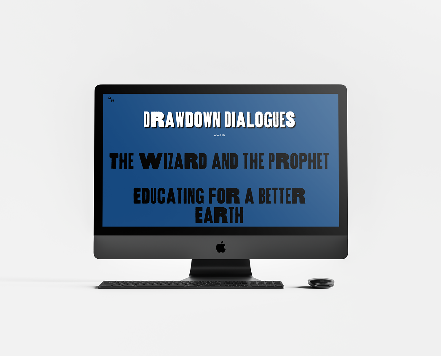
In collaboration with IDEO ↗ I had the opportunity to work on a web-based campaign that helps to knock down the daunting barrier of understanding problems within this space by highlighting the stories of five different climate leaders. Explore the Campaign ↗
THE PROBLEM
When we began compiling all the visual and written materials, we asked ourselves: What issues do users face while reading longform content online?

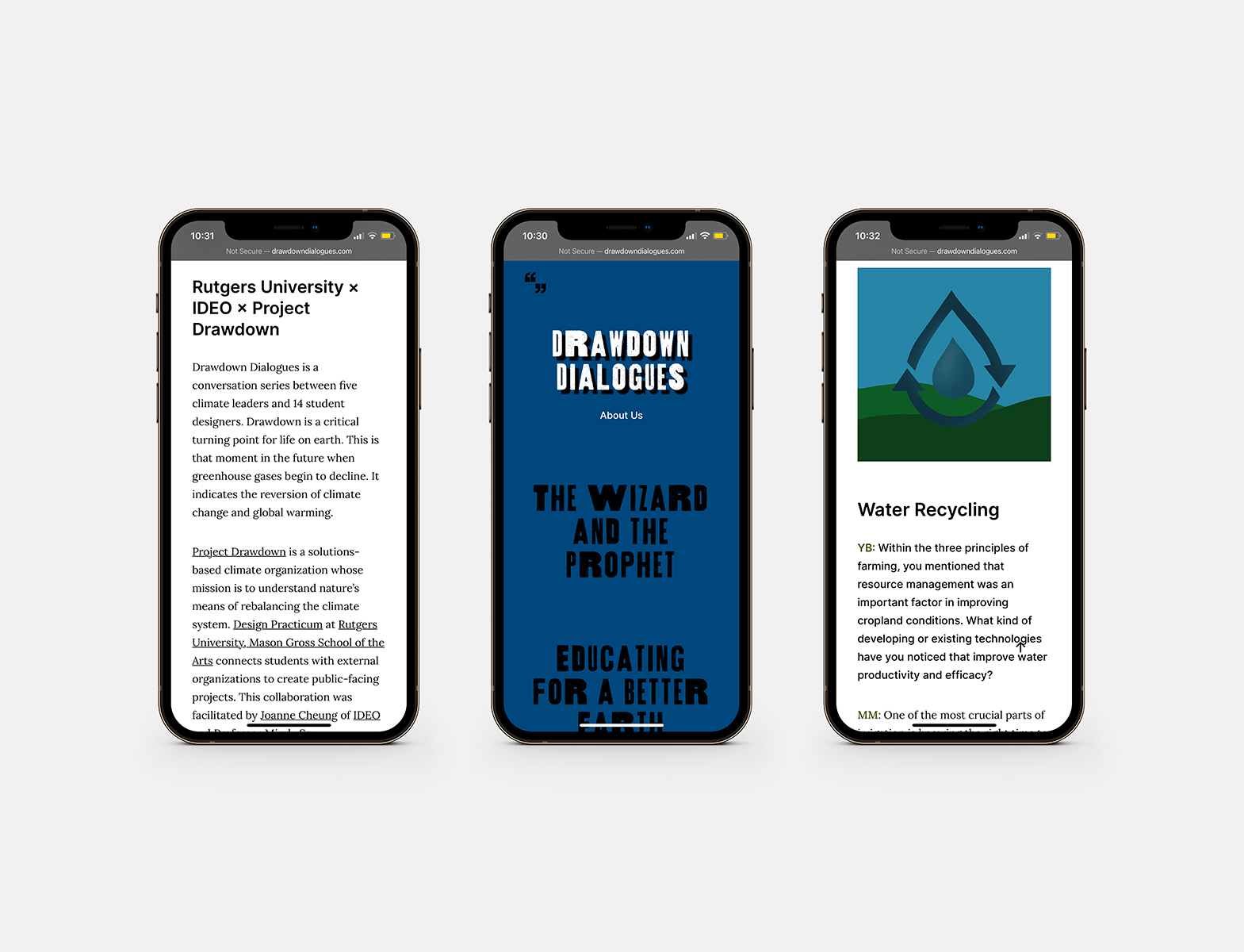
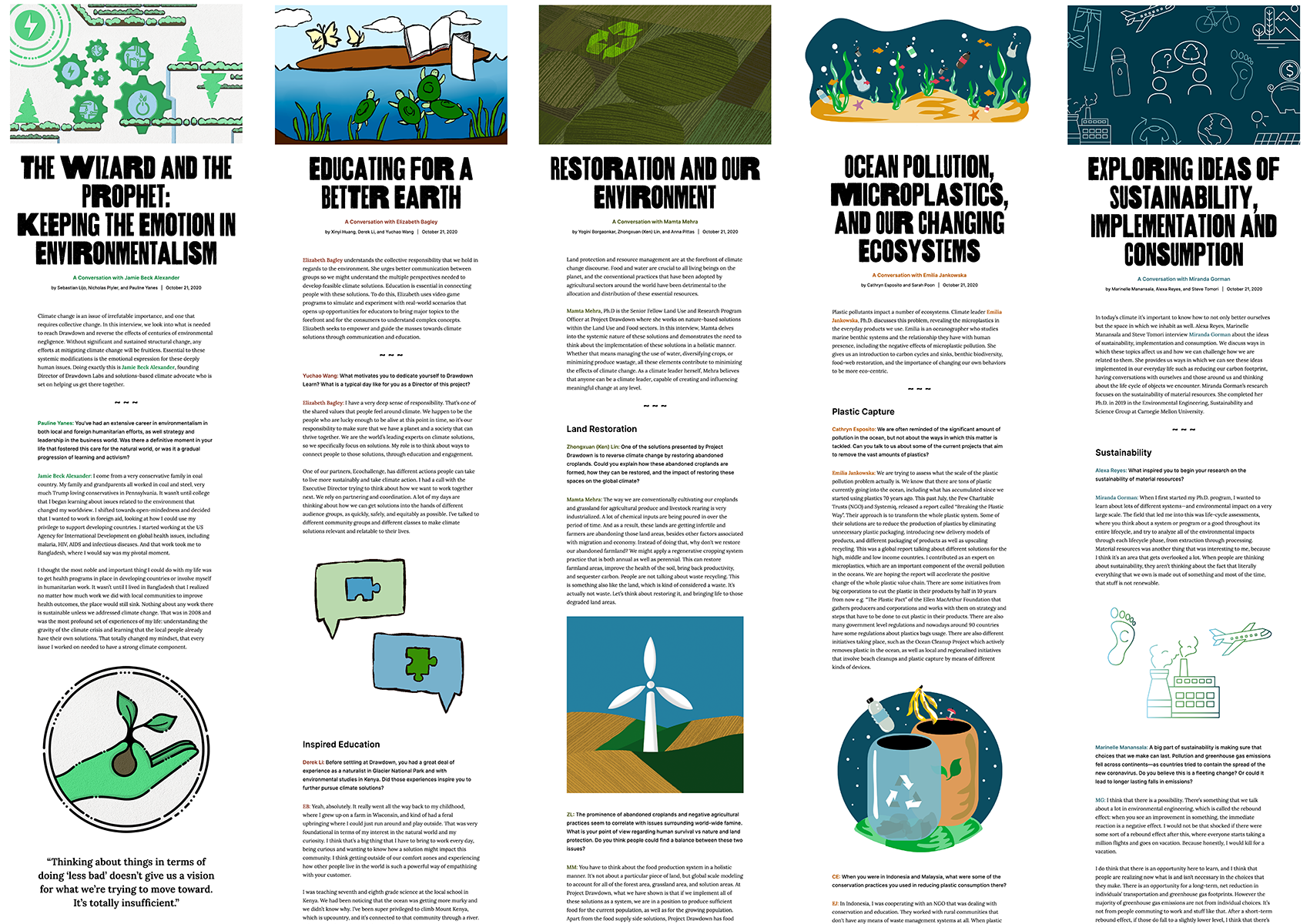
After a couple rounds of editing and creating illustrations, a set of text and four images were collected as the final publishable materials from five seperate interviews (pictured above are the assets used for
Restoration and Our Environment: A Conversation with Mamta Mehra↗
Early insights into users’ reading behavior informed our guiding question: How might we cohesively present lengthy interviews about multiple complex issues that invites enthusiastic exploration and engagement of the content?
INSIGHTS
Early insights into users’ reading behavior informed our guiding question: How might we cohesively present lengthy interviews about multiple complex issues that invites enthusiastic exploration and engagement of the content?
INSIGHTS
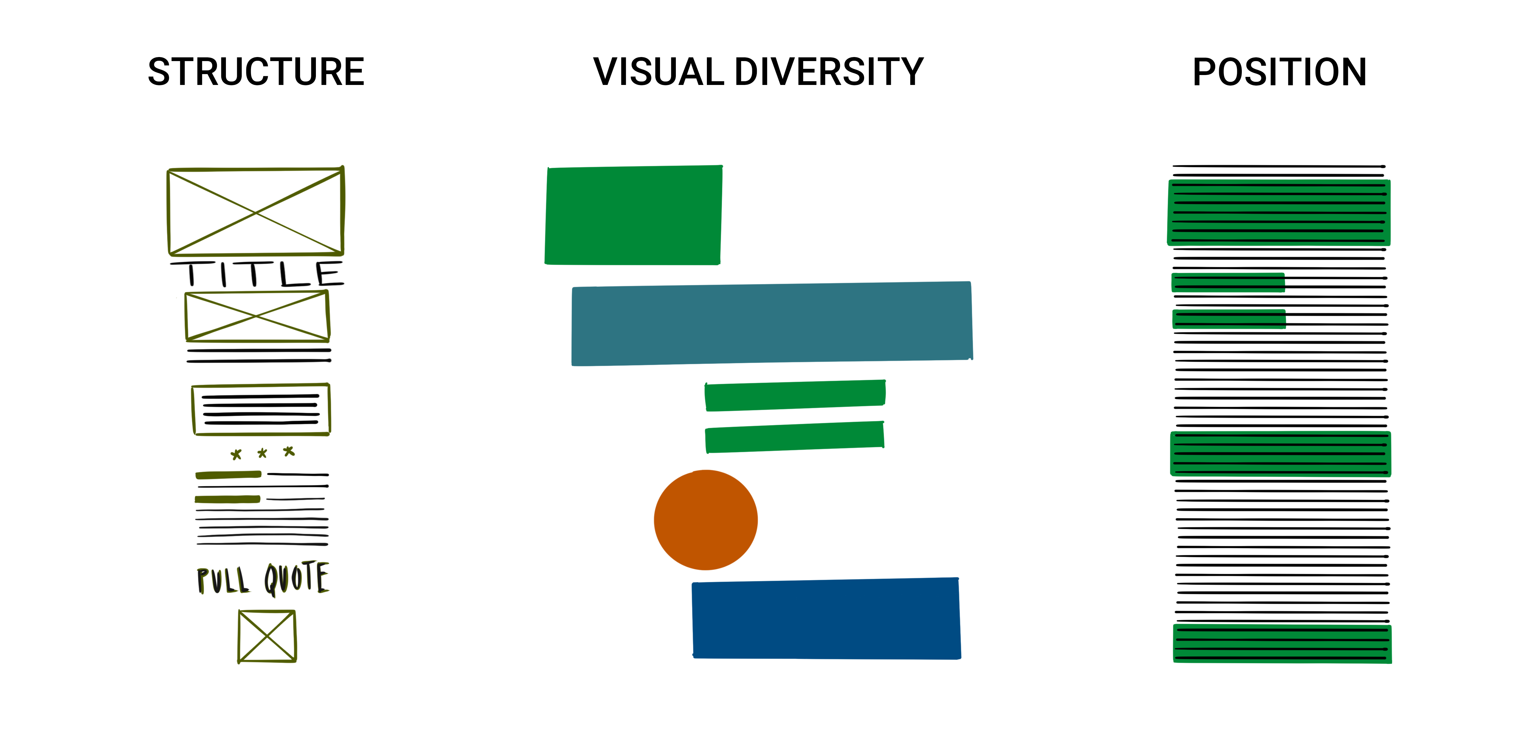
STRUCTURE
A lack of structure within an article can cause boredom and a feeling of monotony for the reader. Maintaining structural recognizability while also allowing each article to have its own distinctive visual cues amplifies the unique nature of each interview and its respective climate leader.
VISUAL DIVERSITY
A lack of textual diversity throughout an article causes elements to blend in with each other, creating visual fatigue for the user. With each interview taking around 10 minutes to read, we wanted to ensure that every article included variation in image, color, and typography for the engagement of the reader.
POSITION
Postional indicators and visual landmarks are essential to avoid the natural distraction that comes with reading a large body of text—especially on a screen. We created a subliminal system for the user to keep track of their location by dividing the interviews into consumable sections through the use of large subheaders and pullout quotes.
All five interviews present similar structural themes, but are made distinct from each other through the use of color and illustration style.
TYPOGRAPHY
TYPOGRAPHY

Thunderhouse is a wood type digitalization used for all headers. Alongside the textured, bold forms, the letters are variable in width creating a sense of natural randomness—creating an approachable, casual first impression for the user.
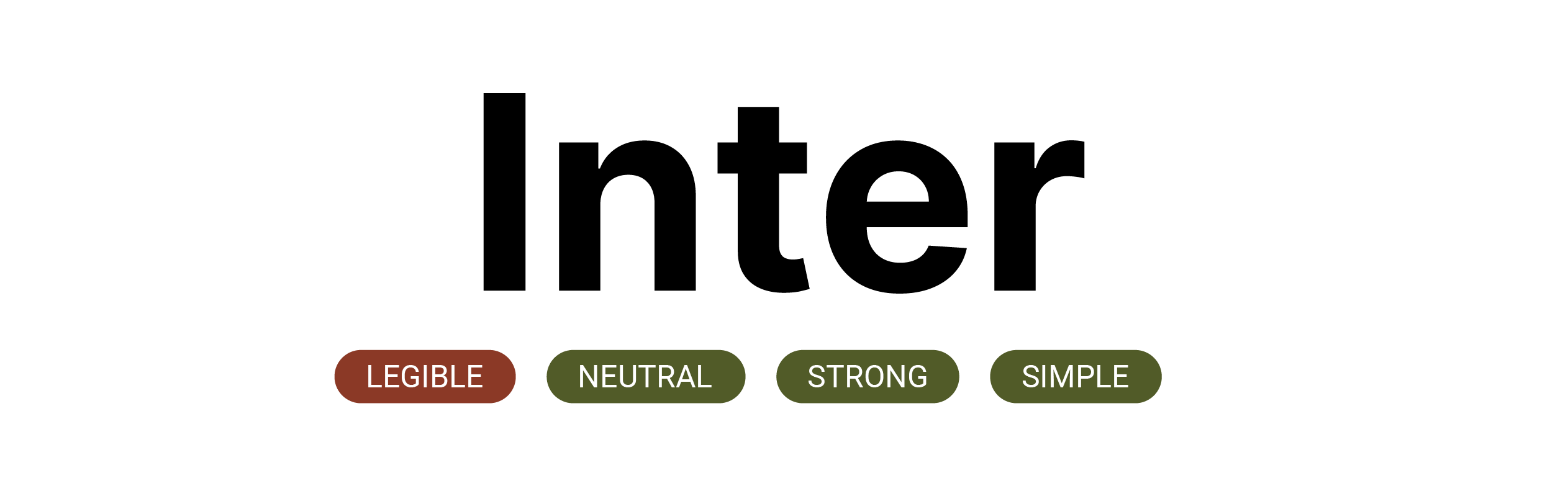
Inter is a sans serif typeface with a strong, neutral structure. Used for headers and subheaders throughout the campaign, Inter possesses a large x-height and simple forms since it was built for high legibility and on-screen interfaces.
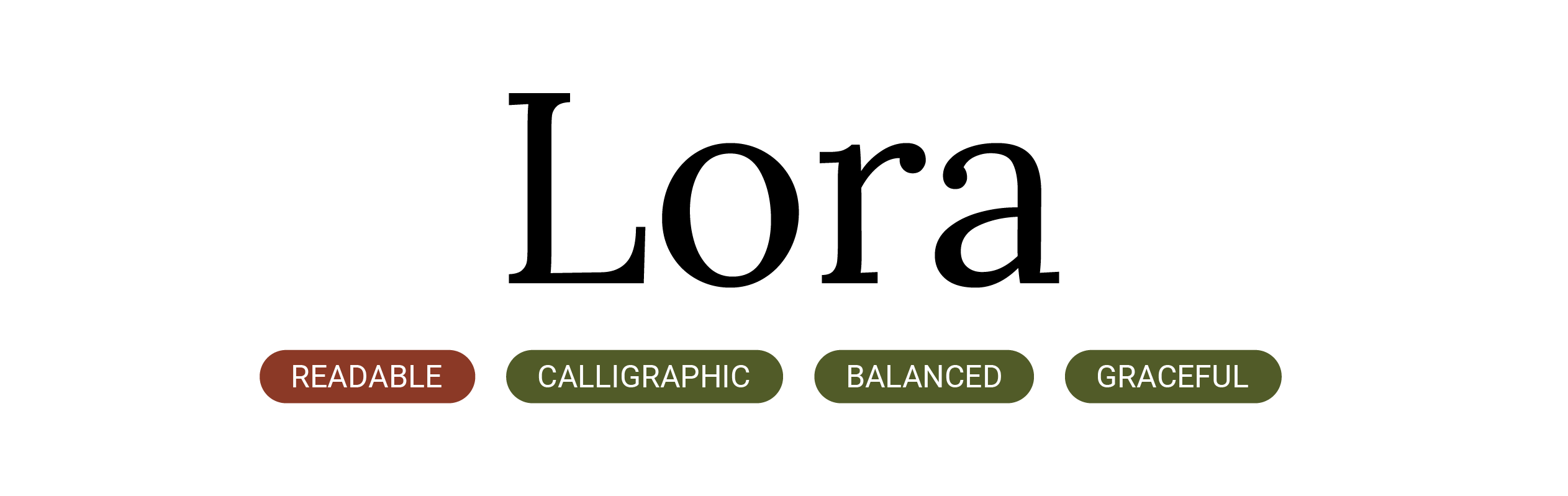
Lora is a serif typeface used for the body copy within the interior pages of the site. With its calligraphy inspired forms, this serif is a well balanced, gracefully curvy addition, incorporating diversity amongst the other sans-serif typefaces.
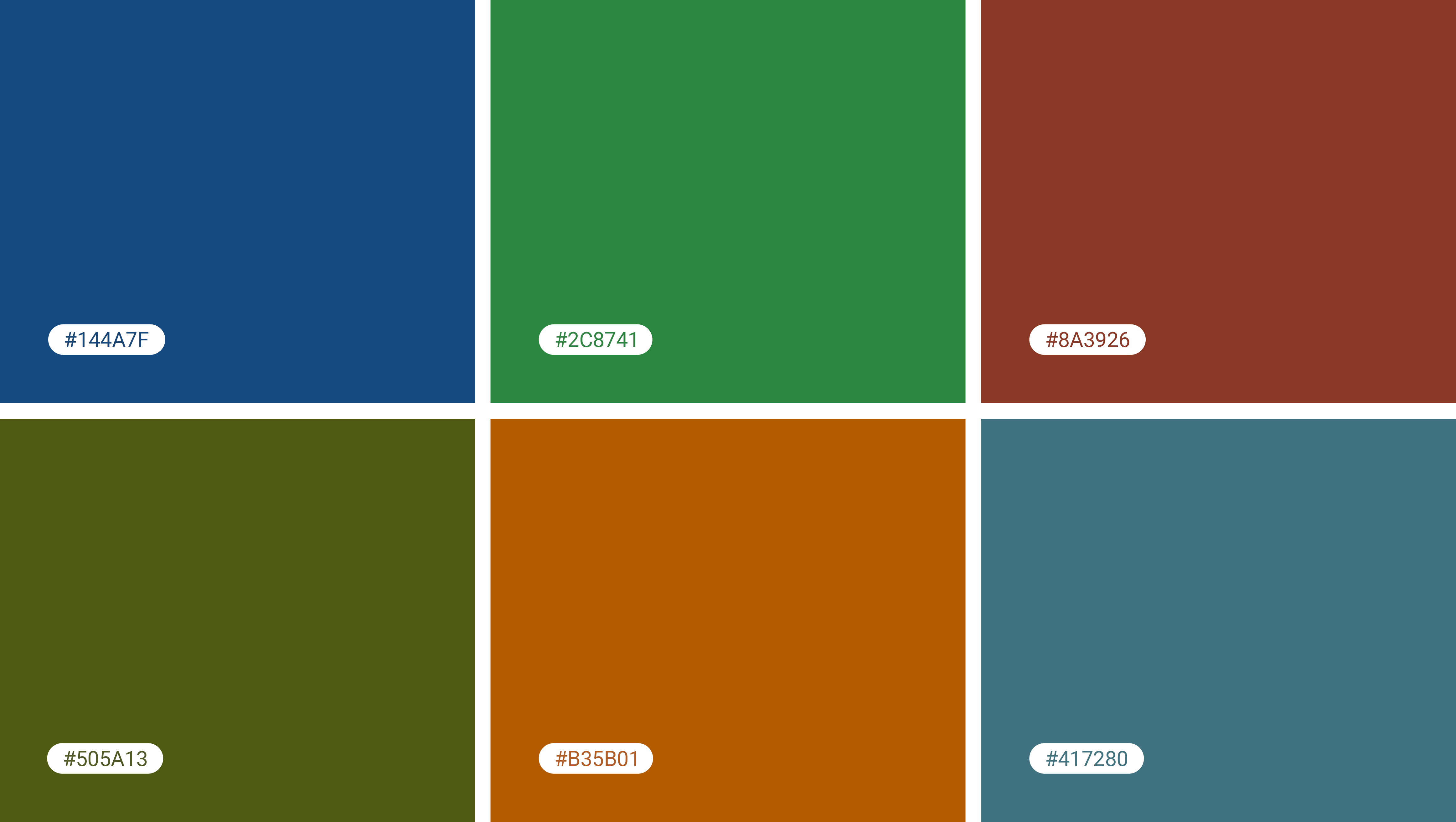
COLOR PALETTE
COLOR PALETTE
RESULTS & REFLECTIONS
As individuals, it feels intimidating to tackle the issues surrounding climate change. However, designers have the unique ability to showcase ideas, worldviews, and stories from a range of different people and organizations.
Through the research, interview, and synthesis processes, Drawdown Dialogues showcases the ability that designers possess in highlighting platforms and inspiring change.