Grimeton Radio Station

Grimeton Radio Station, Varberg ↗ is a UNESCO world heritage monument dedicated to presenting the history of early longwave transatlantic wireless telegraphy in Sweden.
The goal of this brand identity was to feature the site's dual nature by highlighting their historical essence and innovative nature of the technology during its time.
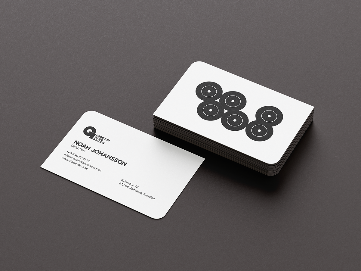
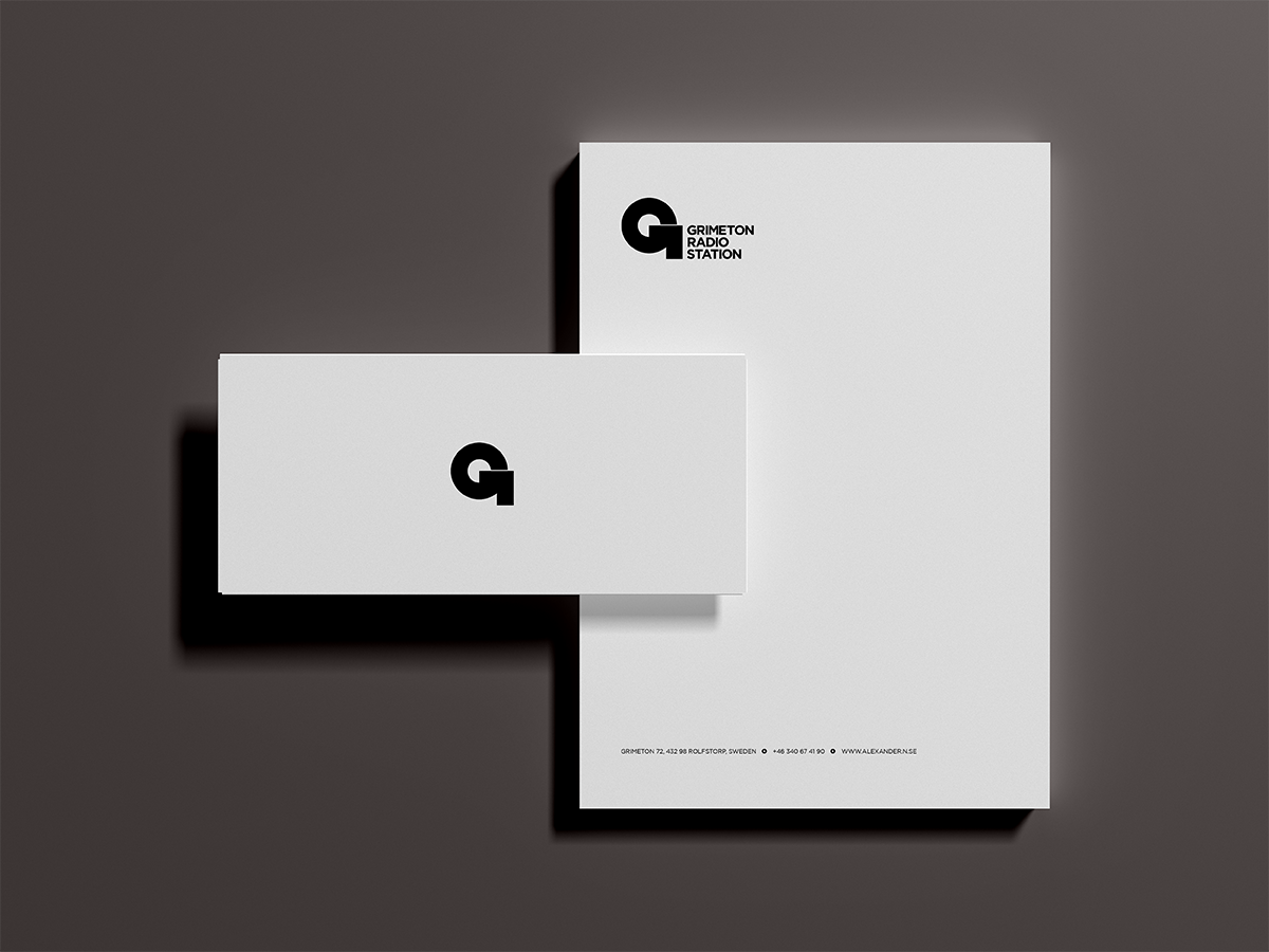
This identity honors the history of the location and technology of the site. The brandmark is inspired by Grimeton Radio Station’s use of Morse code. Using “dots and dashes”, I created an abstracted letter "G" to represent a telecommunications symbol.
TYPOGRAPHY
The goal of this brand identity was to feature the site's dual nature by highlighting their historical essence and innovative nature of the technology during its time.
This identity honors the history of the location and technology of the site. The brandmark is inspired by Grimeton Radio Station’s use of Morse code. Using “dots and dashes”, I created an abstracted letter "G" to represent a telecommunications symbol.
TYPOGRAPHY
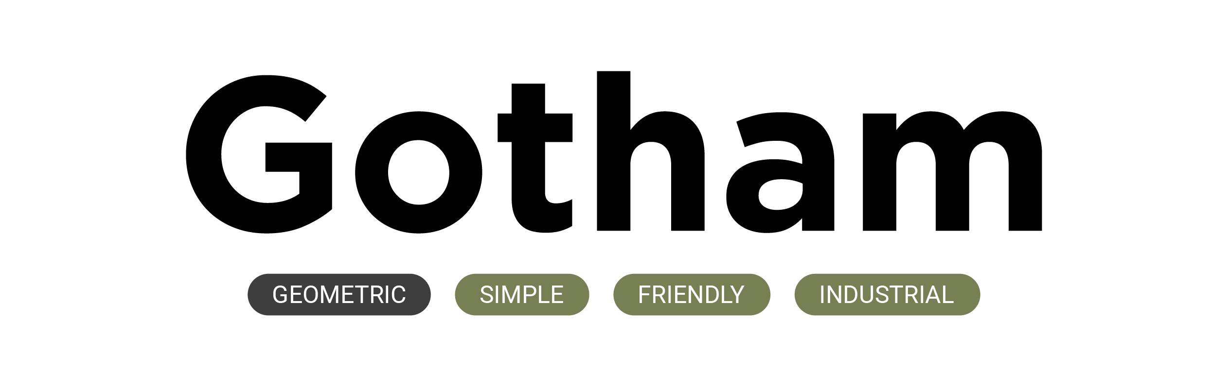
Gotham’s minimal stroke contrast and overall simplicity of the forms adds friendliness to the typography, reinforcing the idea that this preserved site is to be delighted in through exploration.
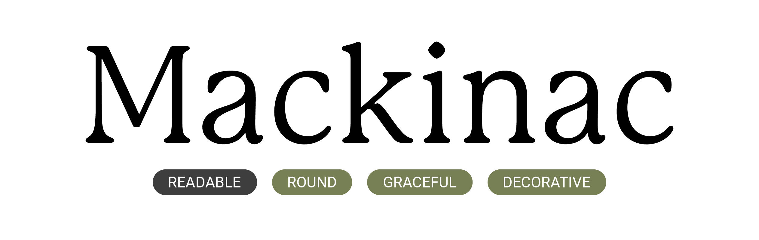
P22 Mackinac’s rounded forms and graceful transitions between thicks and thins perpetuates the stance of Grimeton Radio Station as a place for building creative, innovative solutions.
COLORS
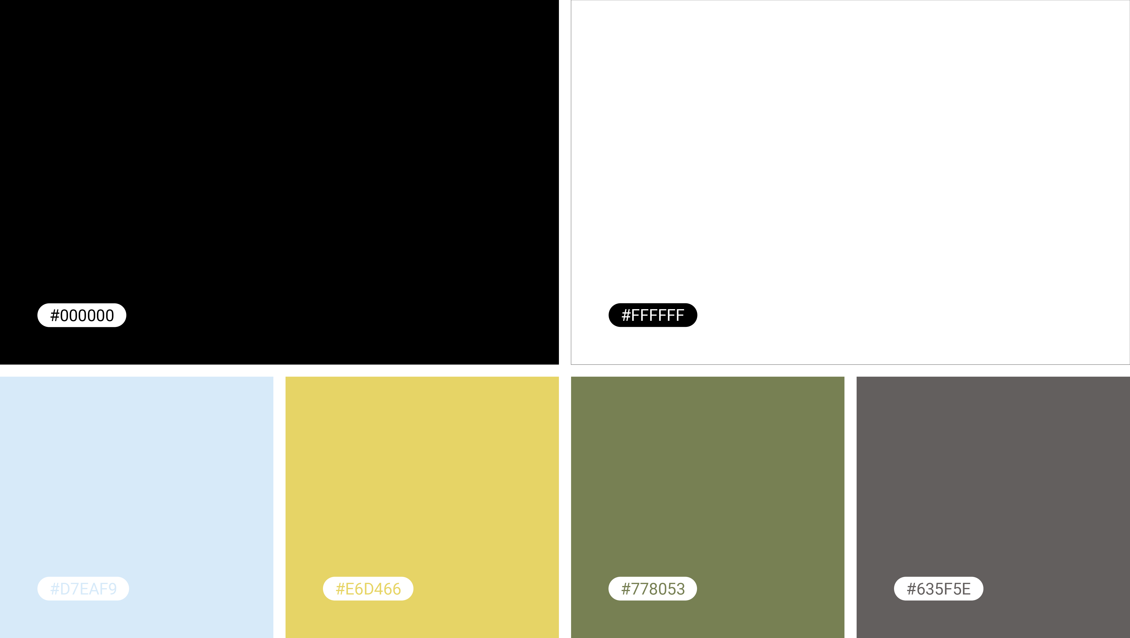
COLORS
WEB

STATIONARY
MERCHANDISE


RESULTS & REFLECTIONS
Identities communicate what is distinctive about an organization and allows the viewer to experience the personality and goals of the institution through visual means. Using a UNESCO site as the basis for an identity allows for the examination on how to enliven a historical space through design.
Identities communicate what is distinctive about an organization and allows the viewer to experience the personality and goals of the institution through visual means. Using a UNESCO site as the basis for an identity allows for the examination on how to enliven a historical space through design.